Exhibition Time!
- Amber Selway

- Apr 30, 2019
- 3 min read
Updated: May 2, 2019
Once all the elements were created, it was time to present my work in The Queensgate Market gallery. Although I didn't know exactly which stall the work was being created for, I had a vague idea of the space. Before setting the work up in situ, I wanted to find out how it might potentially look. I did this by clearing a space in the studio to create my exhibition as I had a few potential ideas for how I might want it to look.
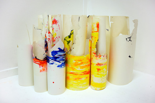
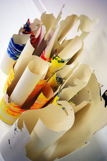
I had considered several different setups which involved either separating the different works or merging them to make one big sculptural piece. I set them out in the ways I had in mind and liked all three. However, I still couldn't decide how I wanted them to go, I couldn't envision it in the space properly because I didn't know what the space looked like.
Setting them up in the studio made me think that merging the two styles made for the most interesting outcome. I didn't want the elements too close together as this seemed overpowering. I was hoping that I would have more room in the new space to change up the way the sculpture would look.
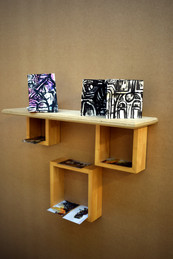
I also knew that I would be needing a shelf for my maps and flyers for visitors to take, I decided upon one main shelf with three box shelves for the flyers to be slotted into as this looked interesting.


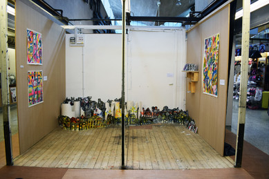
When arriving at the market I realised that there were a lot of spaces to choose from and there were many different places that the work could be placed. I knew that I needed a space that wasn't breezy, somewhere where the sculptures wouldn't be blown over and could stand freely. This prompted me to move away from the door and the main large exhibition into one of the smaller stalls.
Once I found the stall I wanted to use, a risk assessment had to be taken out, making sure that all the potential risk was mitigated and analysed. This included the risks of installing shelves and making sure that they were at the correct height to avoid injury. A huge difference between the space I selected and the studio was the rawness of the area. Unlike the trial space in the studio, the market stall's floor was made up of unpainted wooden panels, one of the walls was white and the other two were untreated. This did affect how the work looked, but I felt that it just added to the work and made it appear less clinical.
When it came to installing the work, I started by just placing things and building upon that. Eventually, I realised that instead of creating the circular shape I had planned in my trial, I'd filled the back wall with my structures. The drawing elements were woven in with the cylinders and they were merged to create a city scene. After I filled the space, I wanted to attach a couple of the drawing pieces to the wall to create a sense of depth. I felt that this worked well and that the final result was better than the trial versions I had created. The work also seemed to fit better in this scene because my work is based around features and detail, something that is lost when it comes to stark white walls.
As for the shelf, I decided to place it on an unpainted wall which meant that it didn't take too much attention away from the main focal point. Although the maps upon the shelf were part of the exhibition, they weren't supposed to be the main feature, they were just acting as an extra, mapping out the structure.
I was happy with the outcome of this project and felt that the exhibition space was successful. I achieved what I wanted to, but if I had more time, I would have explored the process of drawing into wet PVA with ink, including some of those pieces within my final sculpture.


Comments